Typography Study
Hierarchy • Spacing • Visual Rhythm
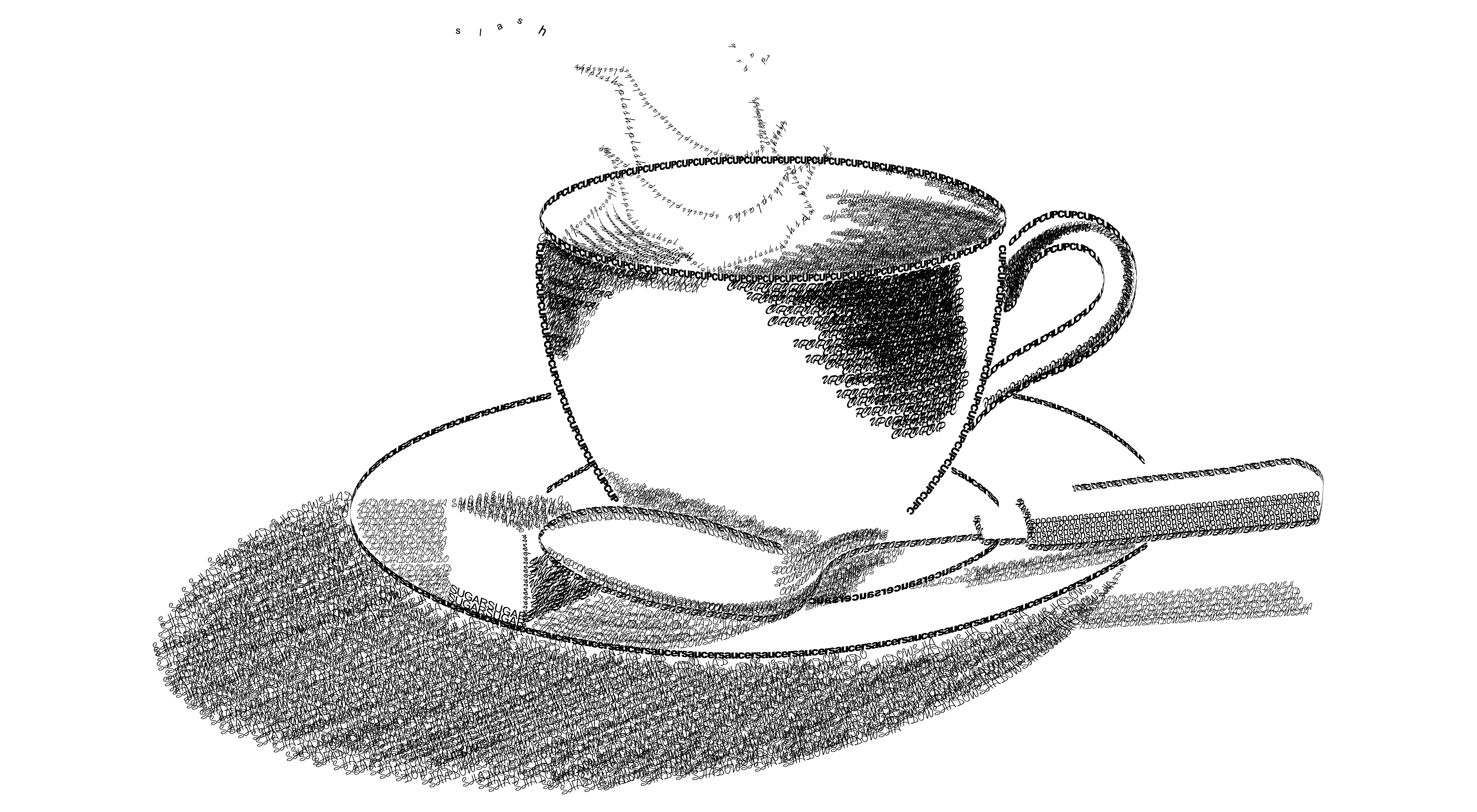
A typography-focused composition exploring hierarchy, spacing, and visual rhythm. I used contrast and alignment to guide the eye while keeping the layout balanced and readable.
Poster
Overview
This study combines a hand-drawn style illustration with a clean typographic structure. The goal is to demonstrate how layout decisions (hierarchy, spacing, alignment, rhythm) can make an artwork feel intentional, readable, and “designed,” not just decorative.
Design Notes
- Value + shading built with hatch-style strokes to create depth and form.
- Clean contour lines to define the cup, saucer, and spoon with simple, readable silhouettes.
- Light direction consistency so highlights/shadows feel realistic and balanced.
- Composition + negative space to keep the focal point clear and the layout calm.
- Texture as emphasis (grain/hatching) to add mood without distracting from the subject.
Typography & UX/UI Principles Applied
UX/UI • Pedagogy • HCI
A short teaching-focused rationale: how layout + typography choices support clarity, learning, and usable communication.
- Information architecture: title → summary → metadata → notes → principles (predictable reading path).
- Visual hierarchy: headings + cards chunk content into “one idea per block.”
- Consistency: repeated spacing + heading styles reduce friction across projects.
- Accessibility: readable type/spacing + clear contrast for scannability.
- Clarity: minimal decoration so the illustration stays the focal point.
- Scaffolded explanation: describe the artifact first, then explain “why it works.”
- Chunking: notes are separated so learners can study one principle at a time.
- Studio critique ready: bullets make feedback easy (what works / what to improve).
- Transferable skills: principles map directly to UI layout (hierarchy, spacing, rhythm).
- Self-check: learners can compare “design notes” vs “principles” to validate reasoning.
- Recognition over recall: clear labels and grouping reduce memorization burden.
- Usability heuristics: clarity, consistency, and predictable navigation support quick scanning.
- Minimal cognitive load: visual noise is reduced so the message is easier to process.
- Feedback via structure: the layout communicates “this is important” through hierarchy, not extra text.
- Accessibility mindset: legibility-first structure supports diverse readers and viewing contexts.
- Critique exercise: students annotate hierarchy (title → sections → bullets) and explain how spacing supports scanning.
- Redesign challenge: create 2 variations (more minimal vs more expressive) while preserving the same information structure.
- UI translation: convert the poster into a responsive webpage card layout (hero + metadata + notes + principles).
- Accessibility check: evaluate contrast, font size, and reading order for mobile vs large-format viewing.
- Reflection prompt: students connect each design note to a UX principle (e.g., “hierarchy” → scannability, “negative space” → cognitive load).
Teaching strategy: observe → describe → connect to principles → critique. This helps students explain design decisions with theory, not just taste.