Algorithm Animator
Concept Poster for an Educational UX Tool
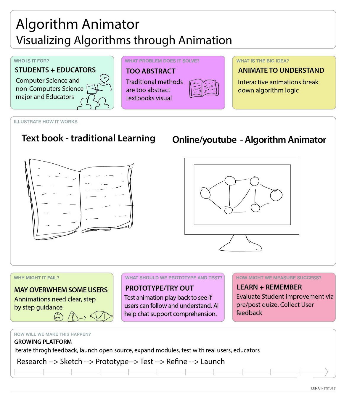
This concept poster was created for my graduate Usability Engineering course using a professor-provided LUMA template. It defines an interactive educational tool called Algorithm Animator, designed to help students and educators—especially those from non-computer science backgrounds—understand abstract algorithms through step-by-step animations.
I used a LUMA-style concept poster to explore the problem-solution space visually. The poster format also became a teaching tool: it fits users, problem, value, risks, metrics, and process on one page.
What the Poster Shows
Concept Poster
Animation
A one-page concept map: users, problem, big idea, risks, prototype plan, success metrics, and process.
How I Use This as a Teaching Assignment
UX/UI • Pedagogy • HCI
A short teaching-focused rationale: what I designed, how I structured learning, and the interaction principles behind it.
- Information architecture: users → problem → big idea → risks → prototype plan → metrics → process.
- Visual hierarchy: one concept per panel so readers scan quickly without losing the narrative.
- Clarity-first communication: simple language and short phrases reduce cognitive load for mixed audiences.
- Teaching-ready format: one-page poster supports presentation, critique, and studio-style discussion.
- Accessibility: clean layout + strong spacing improves readability when projected or printed.
- Scaffolded thinking: start with audience + problem before moving to solutions and features.
- Three-act structure: what’s the need → what’s the idea → how we validate and iterate.
- Active learning: students can remake the poster for a different tool or learner group as an assignment.
- Reflection: risks + metrics force students to justify design decisions, not just “make screens.”
- Assessment mindset: success metrics encourage measurable learning outcomes (not only aesthetics).
- User needs first: the concept is framed around learners’ pain points (abstractness, comprehension gaps).
- Reduce cognitive load: step-by-step animation + chunking supports understanding over memorization.
- Feedback + guidance: prototype ideas (AI help, checkpoints) support error recovery and confidence.
- Evaluation plan: pre/post checks + user feedback reflect evidence-based iteration.
- Usability heuristics: clarity, consistency, and learnability are baked into the concept definition.
Teaching strategy: frame → hypothesize → prototype → test → refine. This trains students to connect UX theory to real educational interaction design.