Algorithm Animator
Concept Poster for an Educational UX Tool
A conceptual poster that frames the “Algorithm Animator” idea: who it’s for, what problem it solves, the value proposition, risks, success measures, and a path to iteration.
This is a concept poster that explores the problem–solution space visually. The one-page format also works as a teaching tool: it brings together the users, problem, value proposition, risks, success metrics, and an iterative process in a clear, scannable layout.
Overview
This poster concept explores how an “Algorithm Animator” platform could help students and educators—especially those who find algorithms too abstract—understand complex ideas through animation. It frames the users, the learning pain point, a clear “animate to understand” value proposition, and the mindset of prototyping and measuring learning outcomes.
Poster
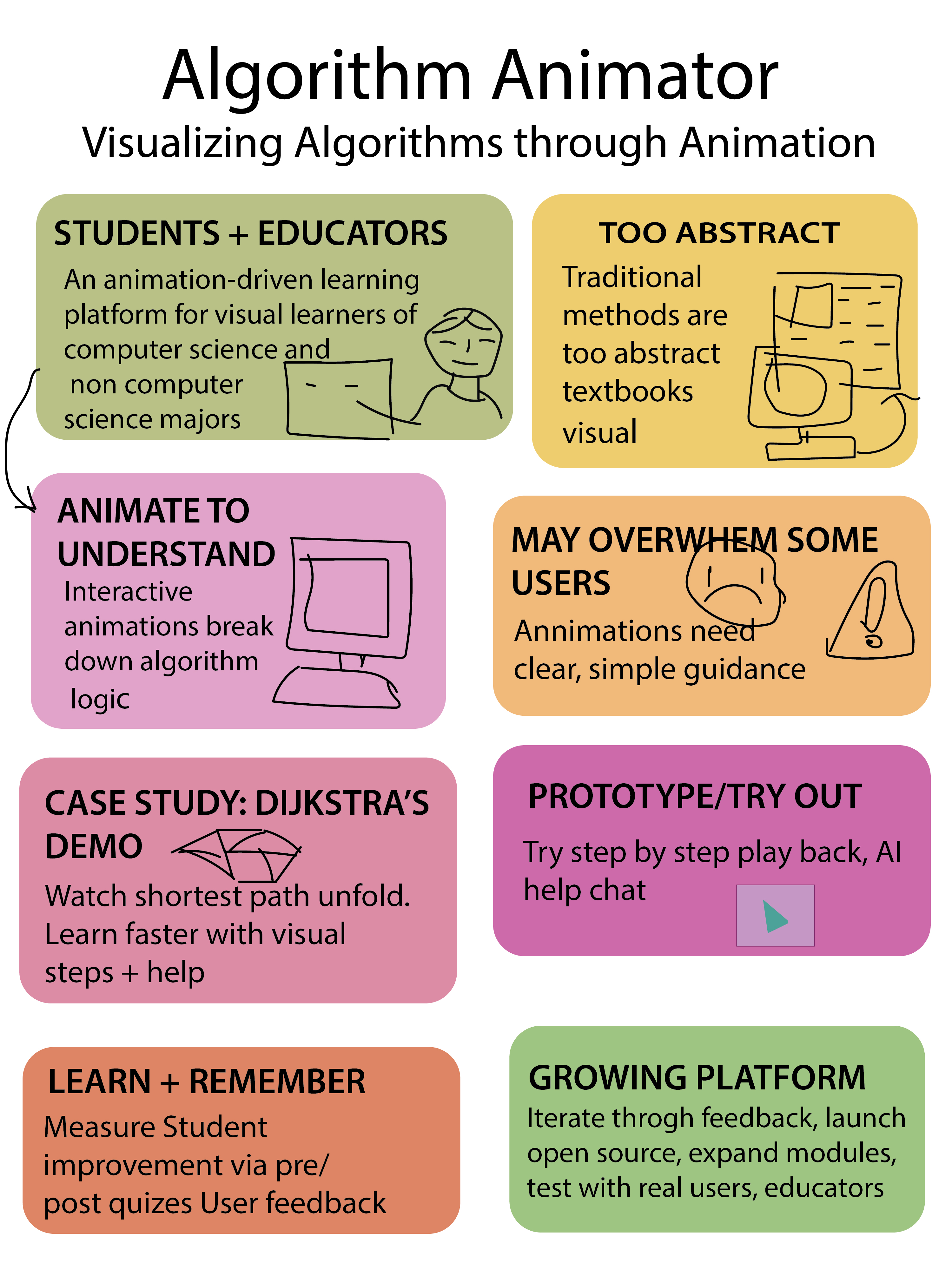
What this poster shows
How I use this as a teaching assignment
This poster works well as a classroom artifact because it fits an entire UX concept on one page. Students can use it to practice user framing, problem statements, value propositions, risks, success metrics, and iteration planning—before designing any screens. It’s also a strong critique format: learners can point to each block and discuss what’s missing, unclear, or needs testing.
UX/UI • Pedagogy • HCI
A short teaching-focused rationale: what I designed, how I structured learning, and the interaction principles behind it.
- Information architecture: users → problem → value → risks → prototype → success → process.
- Visual hierarchy: clear headings + “one idea per box” supports fast scanning.
- Clarity over decoration: short statements prevent the poster from becoming dense.
- Consistency: repeated card/box structure reduces reading friction.
- Accessibility: large type + generous spacing supports presentations and critiques.
- Scaffolded learning: start with “who/why,” then move to testing and measurement.
- Three-act structure: what it is → how it helps → how we validate it.
- Cognitive load: chunking keeps the concept teachable for beginners.
- Concrete example: the Dijkstra case study anchors the abstract concept.
- Reflection: students critique assumptions and propose improvements.
- Mental models: step-by-step animation supports cause → effect understanding.
- Recognition over recall: labeled blocks help learners orient without memorizing structure.
- Error prevention: calling out “overwhelm” prompts pacing + progressive disclosure.
- Feedback cues: pre/post checks connect learning to measurable outcomes.
- Usability heuristics: clarity, consistency, and predictable reading order.
Teaching strategy: frame → hypothesize → prototype → test → refine. This trains UX thinking before interface design.