Identity Marks
Silhouette • Balance • Negative Space
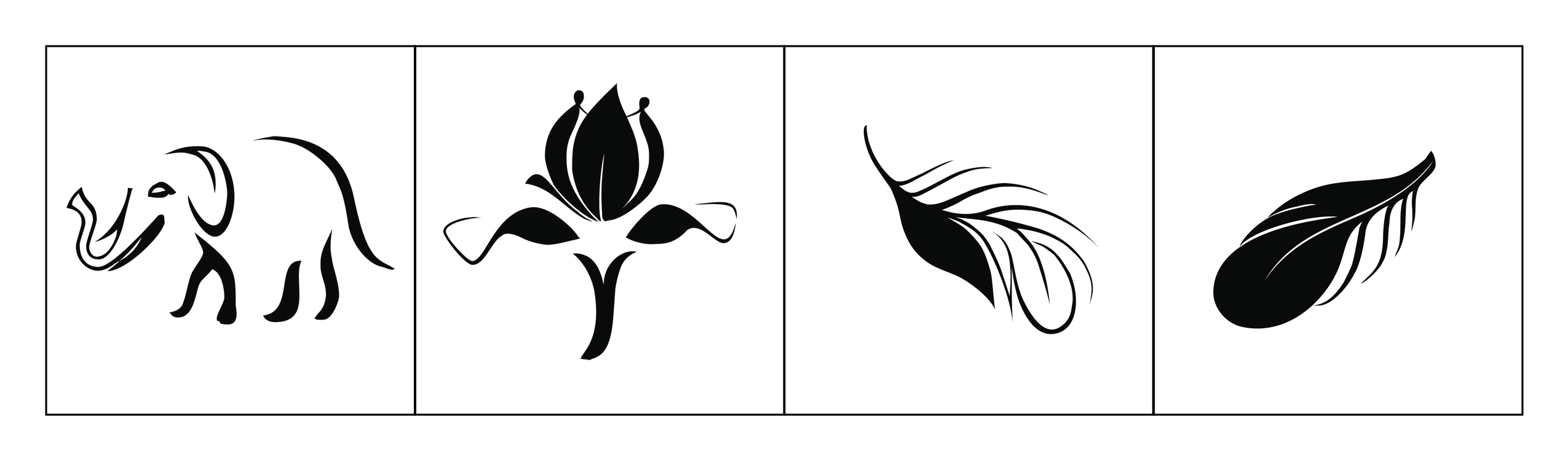
A set of four minimalist marks developed as a study in iconic form, visual balance, and scalability. Each mark is designed to stay recognizable in one color and at small sizes—like an app icon, logo stamp, or brand badge.
Identity Marks
Overview
This project explores how far a simple shape can go. Each mark starts with a strong silhouette, then refines line weight and negative space so it reads quickly and stays memorable. The goal is recognition at a glance— the same requirement we have in UI icon systems and brand identity.
Design Notes
- Silhouette-first: forms are readable even without interior detail (works small and in one color).
- Controlled negative space: whitespace is used to “carve” detail without adding clutter.
- Balance & stability: visual weight is distributed so the mark feels grounded, not top-heavy.
- Stroke/shape rhythm: curves and tapers guide the eye and create a consistent style across the set.
- Scalability: designed to remain legible for favicon/app-icon use and clear for large-format use.
Visual System & UX/UI Principles Applied
UX/UI • Pedagogy • HCI
How identity mark-making connects to UX/UI: icons, visual systems, constraints, and clarity-first communication.
- Icon thinking: design for fast scanning, not long viewing.
- Design systems: consistent visual language across multiple assets.
- Accessibility mindset: strong contrast and clear shapes improve legibility.
- Constraint-led clarity: one-color forces better hierarchy and simpler forms.
- Reusable components: marks can scale into favicons, buttons, badges, and headers.
- Process over polish: students learn iteration (sketch → refine → simplify → test at small sizes).
- Critique-ready criteria: evaluate silhouette, balance, negative space, and scalability.
- Transfer to UI: connect mark-making rules to iconography and interface clarity.
- Vocabulary building: students practice explaining decisions with principles, not taste.
- Assessment idea: redesign one mark for “small-size first” and justify changes.
- Recognition over recall: simple forms reduce memory load.
- Consistency: predictable visual language improves comprehension.
- Minimal cognitive load: fewer details = faster processing.
- Error reduction: clear shapes reduce misinterpretation (important in icon design).
- Context adaptability: works across environments (dark/light backgrounds, print/screen).
- Warm-up: 10-minute silhouette sketch challenge (no details, only shape).
- Iteration exercise: reduce a detailed drawing into a one-color mark in 3 rounds.
- Icon test: show marks at 16px/24px/48px and identify what breaks first.
- System thinking: students create a 4-icon set with a shared style guide.
- Reflection: connect each change to a principle (clarity, balance, cognitive load).
Teaching strategy: simplify → test at small size → refine → explain with principles. This mirrors UX workflows (constraints, iteration, validation).