Identity Marks — Case Study
A silhouette-first mark-making workflow (sketch → scan → refine)
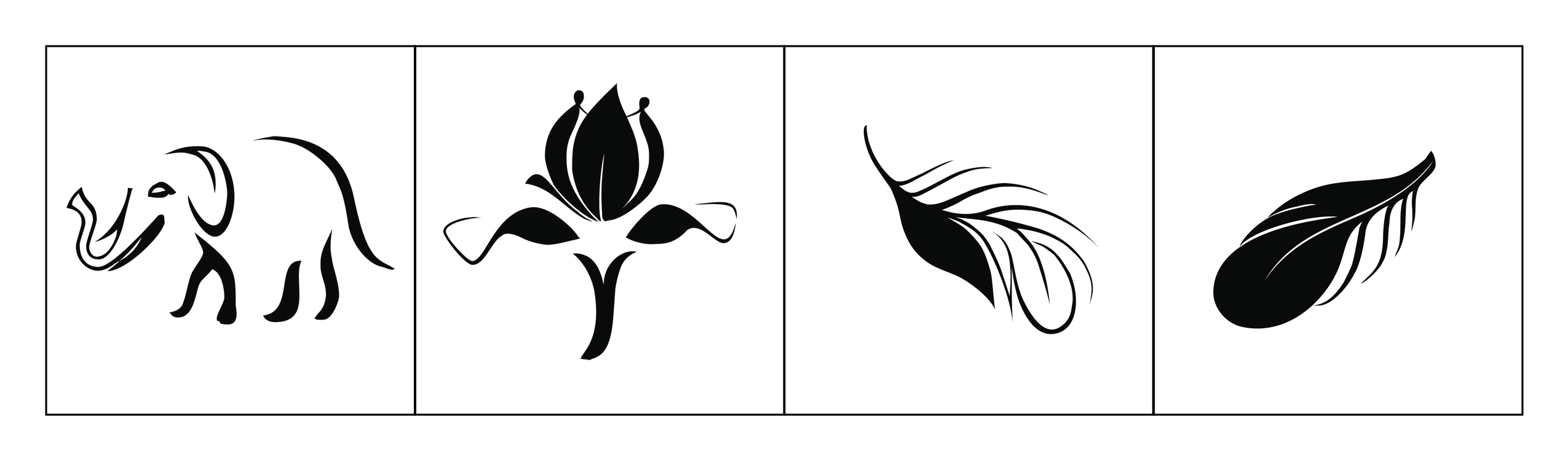
This case study summarizes my end-to-end process for developing four identity marks. I began with high-volume exploration (20–50 sketches per mark), then scanned selected directions into line art and refined them into clean vector marks designed to remain recognizable at small sizes.
Project Brief
Create four one-color identity marks that are recognizable at small sizes and strong as silhouettes. Each mark should feel distinct, but the overall set should maintain consistent visual weight and finish.
- One color (works in black/white)
- Legible at small sizes (icon-ready)
- Minimal interior detail (clarity-first)
- Consistent style across the set
- Instant silhouette recognition
- Balanced negative space
- Clean vector construction
- Feels “finished” as a logo stamp
Workflow (Text Summary)
- Silhouette test: fill as a solid shape—does it still read?
- Negative-space test: remove interior detail—does meaning remain?
- Balance test: does the mark feel stable and centered?
- Consistency test: do the marks feel like one set?
Final Outcomes
- 4 final marks (vector)
- Consistent one-color presentation
- Ready for icon / brand stamp use
- Silhouette-first design
- Balanced negative space
- Clean curves and readable forms
- Consistent finish across the set
Teaching Use (UX/UI + Visual Systems)
This project connects directly to UX/UI teaching because identity marks and UI icons share the same goals: recognition over recall, consistent visual systems, and clarity under constraints.
- 10-minute silhouette sketch sprint (no details)
- Three rounds of simplification (remove detail each round)
- Peer critique using criteria (silhouette, balance, negative space)
- Convert one sketch into a clean vector mark
- Silhouette clarity
- Negative space control
- Consistency across a set
- Rationale (explain design choices)
Teaching strategy: simplify → test → refine → explain with principles. This mirrors UX workflows: constraints, iteration, validation, and clear communication.
Reflection
The strongest lesson from this project is that constraints create clarity. The marks improved most when I removed details and focused on strong silhouettes, balanced negative space, and a consistent system finish.